TL;DR
A Livingetc report finds designers divided over whether butter yellow is a lasting interior color or a trend that may feel overused. They say its warmth and adaptability support its staying power, but identify deeper, earthier shades as potential next steps; no industry-wide forecast or confirmed shift is established.
Designers interviewed by Livingetc disagree on whether butter yellow will remain a lasting choice for home interiors or eventually feel overused, while pointing to deeper, warmer and earthier shades as possible successors. Their views frame the color’s future as a question of how people use it, rather than evidence of a confirmed industry-wide move away from it.
The report describes butter yellow as a soft pastel that has gained popularity as homeowners look for rooms that feel warmer than interiors dominated by bright white and cool gray. Designers say the shade can occupy a middle ground between a neutral and a more assertive color, bringing warmth without taking over a room. Its compatibility with warm wood, natural stone, aged brass and patterned fabrics is part of its appeal.
Designers differ over whether that appeal amounts to lasting relevance. Ailsa MacConnell of Edinburgh-based Studio Mac says the color’s softness and versatility make it more than a fleeting trend. Laura Stephens draws a distinction between the color itself and its current popularity: she says butter yellow has longevity, but cautions that a specific shade should not automatically be treated as a timeless neutral like cream or stone. Used everywhere simply because it is fashionable, she says, it can begin to feel overexposed.
The report also includes designers who link longevity to individual taste and considered use. Color consultant Charlotte Cropper says a shade can feel timeless to someone who has always liked it, while Kelsey Coppetti of Studio Marrant warns that choosing it only because it is on trend may make it easier to abandon when tastes shift. The article points to emerging colors with more depth, warmth and earthiness, but does not name a single successor as a settled forecast.
How the Color Could Age at Home
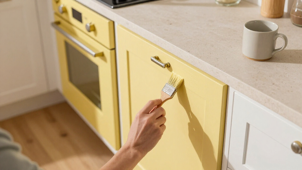
The debate matters to people deciding whether to use a popular color on a lasting surface, such as walls or built-in cabinetry, or to introduce it in ways that are easier to change. The designers’ comments suggest the risk is not simply that butter yellow will go out of fashion; it is that broad, trend-led use may make a once-welcoming shade feel dated sooner to some homeowners.
For readers planning a room, the practical distinction is between a color’s staying power and the staying power of a particular decorating moment. Butter yellow may continue to work alongside natural materials and other colors even if its current peak of visibility passes. A restrained application, or a choice grounded in personal preference, can reduce dependence on whether the shade remains prominent in future trend coverage. These are designers’ opinions, not a guarantee about resale value or future consumer tastes.
As an affiliate, we earn on qualifying purchases.
From Historic Hue to Current Favorite
Butter yellow is not a new invention, according to Rachel Rector of Florida design studio Chinotto House. She says versions of the shade appear in 18th- and 19th-century European and American interiors, as well as Spanish Mediterranean, Victorian, Colonial Revival and mid-century design. That history supports the view that yellow tones can recur across styles, though it does not establish that today’s particular butter-yellow trend will remain popular.
Designers quoted by Livingetc connect its recent appeal to a broader desire for softer, more welcoming rooms after years of stark whites and cool grays. Its muted quality can make it feel less demanding than brighter yellows. The report uses paint and room examples, including Farrow & Ball’s Hay, to illustrate how a restrained yellow can be paired with other finishes and colors rather than used as a single, all-consuming statement.
““Butter yellow has been around for years and will be around for many more to come.””
— Ailsa MacConnell, Studio Mac
As an affiliate, we earn on qualifying purchases.
No Successor Is Settled Yet
The report presents individual designer opinions, not a survey of homeowners, sales data, or a formal forecast from the interiors industry. It does not establish when butter yellow might lose prominence, whether its popularity is already declining, or which specific shade will take its place. The successors are described broadly as colors with more depth, warmth and earthiness, so their names and likely reach remain unclear.
It is also uncertain how widely designers share these views or how consumers will respond to the color in the years ahead. A shade’s use in a particular home depends on the owner, the room and the surrounding materials; the source does not offer a measurable test for whether butter yellow is “timeless.”
As an affiliate, we earn on qualifying purchases.
Watch How Designers Use Color
The article offers no scheduled follow-up, product launch or formal design-industry milestone. The next indication of a shift will come from how designers and homeowners use butter yellow in new projects, and whether richer, earthier tones gain visibility alongside it. For now, the report’s evidence supports a mixed outlook: some designers expect the color to endure, while others anticipate that its application and prominence will change.
Anyone considering the shade can weigh whether they genuinely like it and how easily they could change the surfaces where it appears. The designers’ comments support treating butter yellow as a flexible color choice, not assuming that its present popularity guarantees future demand or that its current trend status makes it unsuitable for long-term use.
As an affiliate, we earn on qualifying purchases.
Key Questions
Do designers think butter yellow is timeless?
They disagree. Ailsa MacConnell sees it as a lasting color because of its softness and versatility, while Laura Stephens says it can endure but should not automatically be treated like a timeless neutral.
Why has butter yellow become popular in interiors?
Designers quoted by Livingetc say it adds warmth without feeling too bold, particularly for people seeking alternatives to stark white and cool gray. They also point to its compatibility with wood, stone, brass and patterned fabrics.
What colors might replace butter yellow?
The report describes possible successors as deeper, warmer and earthier shades. It does not identify one specific color as the confirmed next trend.
How can homeowners use butter yellow without overcommitting?
The designers’ advice favors using the shade with restraint and choosing it because it suits personal taste, rather than relying only on its current popularity. The report does not prescribe a particular room or application.
Source: rss